


In this photo, you can see the hideous fan I couldn't wait to remove. Unfortunately, after the granny curtains were removed from the living room window, and we actually moved into the house, I realized how much that fan must've been used. It gets so hot since our living room faces southwest. Another reason to live in a house for awhile before making decisions!


Here is another before. Our new white trim and light had just been installed.

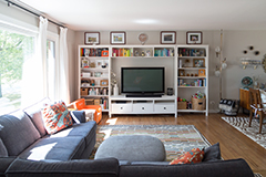
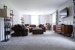
Here is this view today - the 'money shot!' What I love about this before and after, is that only the paint and accessories are different. All the main elements were already there in the before. You don't have to spend a lot of money to make a space look much better!

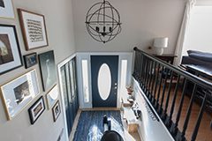
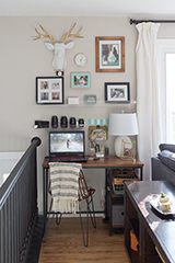
I can't tell you how much more I smile when I walk past the front door now. Here is a closer look at the rag rug I got on Overstock. It feels so good to cover up that floor tile! I chose this rug for many reasons. I knew a lighter rug would get filthy, I also wanted a reversible one, and it needed to be low enough to fit under the door. The price ($35) was the deciding factor. There are many colors on the website, but our new blue sectional in the living room made me go for this color palette.

Based on the colors in the rug, I decided to paint the front door and closet doors with another shade of Fusion Mineral paint called Midnight Blue. I picked up a sample jar to make sure, and loved it.

I think this is such a fun way to handle the dated doors.

I really wanted to replace the bifold doors with plain white ones. Unsurprisingly, the opening for the closet is 47 inches, instead of the standard 48. Rather than special order smaller doors, I decided to just reuse the ones we had while I figure out what I want to do. I couldn't think of a way to update the dated glass inserts, but thought with the right treatment, they could look ok. After the dark paint and incredible Anthropologie knobs, they look almost cute and antique.

The opposite of the closet had a sliver of space for a small stool and table. I found them at Target, and dressed them up with some accessories to make it look more homey. I knew I was on the right track when Shaun came home from work after my styling and said 'It looks like a hotel in here!' I sit right on that stool while waiting for Ashford to get off the school bus every day.

The planter is an old one from Ikea, the indigo candle is from Target, as well as the gold tray. The marble clock is from World Market, but I may move that to the guest room nightstand.

I found the pillow at Home Goods, and the faux fur is one of my newborn session props!

The black coat rack from Pottern Barn has been a lifesaver. It's usually stuffed full, and is sturdy enough for bags and backpacks. I love getting that stuff off the floor.

All of this is wonderful, but my very favorite part of the new look is my gallery wall. I have never done one, I thought I lacked the creativity to put the different frames together, and also just didn't know where to start. Then, Art.com sent me a mailer with the most adorable print advertised.

Fowl with Pearls (mounted on wood) became mine! Look at her, so disapproving and regal.

I had originally thought a mix of black and white frames would be ideal, but then I went to Target and saw the gold frames. They were inexpensive, but didn't look it. I decided a mix of gold, black and wood frames would be beautiful and tie in everything I had going on here. Since the existing front door and sidelites have a ton of gold detail running through them, and the door handle is polished brass, I chose to embrace it. If you're looking for gold frames, these look so much better in person than online! Not sure why they call them 'mat bronze,' though.

I started the hanging process with paper templates of the artwork, the gold frames, and some simple black frames I got at Michaels.

I then filled in the remaining spaces with the framed watercolor dots from Target, and other wood frames. I also splurged on another smaller wood-mount art print from Art.com, the dashing Gavroche.

I just love it all together! I wish I could continue the gallery all the way to the ceiling and around to the right, but it's so hard to hang things that high. I already had to resort to unsafe measures just to get that watercolor print hung. (Think a board laying in between a step and a ladder. Yikes!)

It feels so much better to have something to look at as you trudge up the stairs carrying 8 bags of groceries.

So, this space isn't really done, I have another coat to do on the railing, and some more work on the stairs going down. For now, I'm calling it done and taking a break! Here are some before and after comparisons to see how far it's come in here.


It looks amazing! I love, love, love it when a new post of yours shows up in my blog reader. Thanks for continuing to share with us, even with how busy life is for you.
ReplyDeleteThank you, Bobbie! I really appreciate this comment. I love blogging, can't imagine stopping. So glad I still have fans!
DeleteSo many changes. Excellent transformation.
ReplyDeleteHi, Sharon! Thanks so much, hope you are well!
DeleteTotal transformation! Looks awesome!
ReplyDeleteThank you so much!
DeleteMy inlaws have a near-identical set-up for their entrance. Yours looks incredible! I'm still trying to convince my MIL the dusty rose walls need to go ;)
ReplyDeleteThanks, Laura! My in laws also live in the same floor plan as us. No dusty rose, though! Haha
DeleteLooks great! The "matching" doors look so much better! I'm in love with that chicken print, what a hoot.
ReplyDeleteThanks, Steph! We love the quirky animal prints, so fun.
DeleteI love the blue and black together. Very cool. I am searching the house to find something to paint now. Hopefully Thursday is a good day to run to Spruce. The place looks rockin'!
ReplyDeleteThanks, Mary! Spruce it a fun place. Very creative stuff for sale, in addition to the wonderful paint!
DeleteLooks great! I'm a long time follower of your blog, and you are a rarity! Almost all of the blogs I used to follow have gone totally commercial, or are totally gone!
ReplyDeleteThanks, Betsy! Yeah, I blog because I like it. It does take a long time, but I can't imagine stopping or taking ads. I'm glad I still have readers like you!
DeleteIt looks AWESOME! I wish I could have those knobs for my kitchen, but I'd go broke buying that many of them. haha Everything works so well together.
ReplyDeleteThank you! Yeah...$18 knobs are crazy. Glad I only needed 2! Haha
DeleteGah! This looks so amazing! You do such an incredible job of thinking through every detail - that is not my strong suit. But I love the change - and it's so practical!
ReplyDeleteThank you, Kim! You made my day!
DeleteThe transformation looks so good! I love the blue color. I have been looking for something like that for the vanity in my son's bathroom. You also may have inspired me to do a gallery wall up my stairs... but I am kind of lazy, so we shall see. Oh, and I think that the panes do look antique!
ReplyDelete