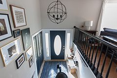
What a strange time to be alive! With the corona virus shut down eliminating my photography business, I've been going a little crazy like most people. We are a very extroverted and social family, so we've been trying to get outside to say hi to neighbors, but still be safe. In all this uncertainty, I have found myself very uninterested in editing photos I've taken of my kids, being on the computer for any length of time, and being creative in general. I just have lacked the drive, and the kids (and cleaning up after them) take up so much of my time! Luckily, I finally have a project that got me excited to share. For the last five years, I've been walking in my front door and staring at an empty wall at the bottom of the stairs. Like this....

I bought a few items for this wall a few years ago (haha classic Sara move) and they have sat in a basket since then. My problem was that I wanted to add color to this little wall, but I didn't want to continue the color ALL the way down to the family room since it's all connected. I dreamed up trim/ moldings, sharpie designs, all kinds of ways to stop the color here...but nothing really resonated with me. Then I saw some wall inspiration in one of my photography groups, and this idea was born. I love it so much!

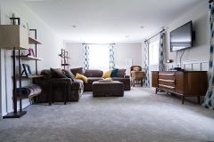
I love making our ugly raised ranch cute ONE SPACE AT A TIME! The idea of this technique is to blur the line between the two colors (usually white, but SW Popular Gray in my case) with paper towels and brushes, and make a watercolor type design. When I first decided I wanted to do this, I took stock of the paint samples I had in my house to minimize my time at Home Depot. I had these three colors and a quart of my popular gray paint to try it out on cardboard: from top to bottom, BM Hale Navy, BM Newburg Green, and SW Gale Force that we used in our
master bath in Minnesota.
Hale Navy was too purple-y/navy, Newburg was too green (but I still liked it a lot) and Gale Force was the best of both worlds! I didn't quite have enough to do the project, so I made a quick trip to Home Depot and vowed to never go back until things were back to normal. We also needed a new wax ring for our main bathroom because our toilet was leaking, so I justified my 'essential' trip that way. I bought this quart and a whole gallon of SW Creamy for our main bathroom, which is a very boring post for another day. We did end up replacing our very first was ring, and we were successful! Here is my starting point for this project:
I recommend lightly drawing in pencil where you want the 'line' to go ahead of time, I didn't do that at first and the second wall turned out much better with a guideline! I put the gray right next to my wet line, and then used a paper towel to smear the colors around.
I also used a flat brush that I got with my fusion mineral paints, it worked nice for the more 'sponge painted' areas.
In hindsight, I should've applied the gray to the entire wall on the right side before doing this part. It's also tricky because the dark colors require two coats, and it's almost impossible to do that after it dries without seeing the shiny brush strokes where you touched it up! I look at it as extra texture and not a big deal.
I tried to add areas where the white went farther into the blue to add interest, some work better than others, but I love the randomness of it all.
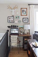
Stupidly, I forgot to take photos of the wall without the other elements up, so I apologize. I was so eager to add my decor! The star is a Smallwoods wooden sign, which is a photo I took during our trip to Rocky Mountain National park last year. I love this, because I didn't want anything with glass to show a strong glare as this area is hit with sunlight all day. I chose a portrait crop to fit into the blue part of the wall better and leave more room for my shelf and hooks.
As you can see, Smallwoods added saturation, exposure, and changed the coloring of the mountains to be quite aqua, which is sort of disappointing. However, it still looks beautiful so I won't complain too much.
The shelf is another one of the cool acrylic shelves from
CB2 that I used in my
office nook. I love these shelves, and they are so great for tight areas where you can't have a shelf stick out too far. They are also great for containing things with the tall raised edge. I love leaning photo frames against them, and I'm on the hunt for the perfect frame(s) since this one is just a placeholder.
The hooks were a
Target find, and they are amazing quality and price!
I made a simple template out of posterboard to make sure they were lined up correctly. I spaced them out to perfectly fit under the 24" shelf, then poked holes through the paper and attached this to the wall in order to drill.
I love how solid these are! I used a very small drill bit to make the holes, so I didn't even need to use anchors. The thought of putting 8 anchors into the wall was not appealing. Side note, the center screw of the shelf did catch a stud, so I didn't use anchors for those, either!
It turned out exactly as I had pictured in my mind. Love the texture of the white paint behind the decor. I did choose to keep decor elements simple as the wall painting is a busy feature in itself!
And after this wall was done, I realized I needed to continue this over the door to the other wall. It just didn't make sense all alone, but once I did the stair wall, it was perfect!
I did a slight 'wave' shape with the blue, and it's beautiful! I love how this technique allows me to keep my house mostly light with just a small amount of drama painted on.
Here are some glamour shots!
It looks pretty with the light on, too. I love this light, even though it barely clears the door.
Here are some before and afters of this fun little redo!
Just for fun, here is a throw back 'before' and after! Oh em gee, those were dark times. Literally.
Cost breakdown:
Quart of Gale Force: $16
Smallwoods Sign: $45
Four Target hooks: $36
CB2 shelf: $25
Total: $122
Let me know what you think of my little project! Hope you all are safe and healthy!