skip to main |
skip to sidebar
Gray paints = gray hairs
My my, repainting the dressing room is proving to be as hard as finding Lindsay Lohan credible work. I found some fun fabric at Joanns that I wanted to use for curtain panels awhile ago, and I got all TEN yards for $5.00....woot woot, hey hey hey, I'm awesome. Nevermind that I don't have any clue how to turn fabric into curtains. That is what google and The Nester are for, because Sara Don't Sew. Anywho, the paint issue is kicking my behind because the gray in the curtains is 'kind of blue and that's not coo.' Here is a glimpse of the fabric and the grays that are tormenting me right at the moment:
The upper left is Behr Dark Pewter, it's too dark. Bottom left is Behr Grey Timber Wolf, it's too purple. Bottom L shaped is Behr Dolphin Fin which I love, but it looks weird with the blue-gray of the curtains. The big swatch was color-matched to the gray in the fabric, however it came out really blue on the wall and I don't likey. It looks 'slate' to me, but it is very close to the fabric gray. I'm thinking about warming the color up a bit with craft paints. Does anyone have any fabulous ideas? Some people custom mix all their colors and swear by it, so if those people could chime in I'm all ears eyes! Here's another shot of the fabric with the custom mix:
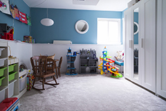
Maybe I do like it? I'm not sure. I don't want the room to look blue. Maybe I should just paint everything red, put some red lace over the windows and call it my 'Lady Gaga' room? At least all the trim is painted. Please don't dwell on the fleshy doors, I know they look terrible. That is another I hate the previous owners of this house project for later.
What say you, decorating divas? Mix and match different grays and hope for the best? Find new fabric with a gray background that I really love?? After all, I'd only be out 5 bones and could find another use for it for sure. Give me your thoughts!
ps - thank you to Jamie for the gray paint samples! She's undergoing a little paint dilemma of her own, all part of her huge home renovation. Progress pics of her place are coming soon!
.jpg)
.jpg)


I used Dolphin Fin on my kitchen cabinets, I love it also.... in
ReplyDeletethere. I used the leftover in my bathroom and the lighting in there gives it an almost purplish cast. I recommend trying all of your samples on all four walls to get the best idea of how they will look.
would painting the room yellow be a terrible thing?
ReplyDeleteI think it would be fantastic.....but totally get it if it's not your thing. Could be overwhelming...
Honestly, I think the L-shaped one looks good! It doesn't "match" but it doesn't need to. They're just two shades of gray and I actually think they compliment each other quite well. My vote is Dolphin Fin!
ReplyDeleteI like the color matched gray, but I also love blue so I wouldn't have any problem with a blue room. Good luck!
ReplyDeleteI wouldn't try to match it exactly. I agree with Amanda, go with the Dolphin Fin!
ReplyDeleteWhen I was picking out curtain fabric for my many different shades of white kitchen, none of the white background fabrics looked right; too dingy, too bright, too yellow... I finally went with a gray and lime green fabric with slight touches of white and it looks great! Well, I think so. My fiance thinks the fabric looks like pajama pants. Oh, well.
You know what, I like the 'L'-shaped, Dolphin Fin swatch best, even with the fabric. It doesn't match, but that's a good thing. Coordinating is MUCH nicer than matchy-matchy. They go nicely together, and that's all that matters.
ReplyDeleteOne thing I noticed when testing gray in my house is that the current wall color can play tricks on you. My walls were yellow when I tested my colors and they all looked way too blue. After I primed a large section white and tried another test, I was able to get a better idea of which gray looked best in the room.
ReplyDeleteFor what it's worth... I used Dolphin Fin in my house and love it :).
I would maybe opt for another fabric. You could definitely find another use for the fabric you bought. I love the dolphin fin color. It's fabulous.
ReplyDeletehmmm... this is a hard one. (that's what she said) I also like dolphin fin the best. Can you paint a larger section of it, maybe that will help you decide? LOVE the fabric!!
ReplyDeleteWe also had fleshy trim and doors in our house when we moved in! I just loved repainting it all... NOT!
hmmm... this is a hard one. (that's what she said) I also like dolphin fin the best. Can you paint a larger section of it, maybe that will help you decide? LOVE the fabric!!
ReplyDeleteWe also had fleshy trim and doors in our house when we moved in! I just loved repainting it all... NOT!
I like the colour matched grey ... I think it is reading blue because it is next to the pink. It looks great with the fabric ... and it appears there is a bit of blue in the flowers. Love the fabric too ... and what a deal!!!! Second choice would be the dolphin fin ... it would make the room lighter and the paint doesn't have to be matchy ... it just has to co-ordinate.
ReplyDeleteAnonymous was me ... for some reason it didn't pick up my name ... S
ReplyDeleteI actually really like the dark grey. Do you happen to have picture rails? If you painted the bottom part of the picture rails the dark grey, the top of the picture rails a half strength grey, and all the trim and the actual picture rails white, it would look awesome.
ReplyDeleteOtherwise, why not just go the dark grey at half strength? The others all seem too matchy for my liking.
DEFINITELY the Dolphin Fin. The others just don't go or are too matchy matchy. The Dolphin Fin is neutral but still goes.
ReplyDeleteI think the pink is throwing you off. I like the color matched color and the dolphin fin.
ReplyDeleteLove the fabric and am wishing I could find those great deals at our fabric store. WTH?
PS. you can totally do a curtain. You Tube can teach you anything. =)
Well, the Dolphin Fin is definitely the least "blue" out of all these. And the others may seem even darker once all of the walls are that color (but maybe you'd be okay with that). I do agree that maybe you should try painting a larger section, if you have enough of the sample left. I'm not much of a painting expert (yet), but I'm sure you'll make a great decision!
ReplyDeleteThe pink is making it hard. I'd go for the Dolphin Fin or the color match. I lean more towards the Dolphin Fin.
ReplyDeleteI have an idea, but I am not sure if you will dig it. What if you did the walls a real real real light gray...almost white, then did the ceiling in a little more darker gray? I think the contrast would be awesome and would really draw your eye up!
ReplyDeleteDanielle - interesting idea! Although painting the ceiling again makes me want to cry. It probably won't happen.
ReplyDeleteAll - Thanks for all your ideas, I'm thinking I will use Dolphin Fin or something similar. I'm heading to Benjamin Moore store today to try out a couple more. Because I need more insanity!
It's so hard to find the perfect grey! I'm feeling your pain, i wnet though the same thing with our bedroom, found the perfect grey.
ReplyDeleteas for the colors you choose, I like 'Behr Dolphin Fin' It's so pretty!!! It looks like a good balance on the curtains and not to matchy matchy...hmm, paint the Delphin Grey in another area and hange the fabric lenthwise and watch it foe a few days in various lights..
i say it's kinda too much gray. but if i had to coose i like the darker one outta them only because the flowers have a dark gray in them...
ReplyDeletejust save the fabric for another project and find another one you love.
I think yellow would be fabulous too to go with the flowers on the curtains! but if you're wanting to stick with grey...i think slightly darker would be better to offset the light grey of the curtains :) good luck!
ReplyDeleteI love the fabric-I say keep it. If you're looking for the exact gray in the curtains take them to the paint counter. They can match the color exactly. If I remember right, I think Home Depot does the best job. Good luck!
ReplyDeleteThat fabric is amazing! Love it...and I think you can definitely mix and match some grey tones in there and that would actually help it look not blue. I can't wait to see the finished room!!
ReplyDeletei really like the dolphin fin (alone or with the curtains) or perhaps a shade lighter of the dolphin fin.
ReplyDeletei'm a big fan of gray shades, but the purple/blue problem has always kept me from putting them in rooms. i vow to have a gray room one of these days!
kelly
I think maybe painting it a light yellow would complement the fabric, instead of looking too matchy matchy. But I'm sure it will look great whatever you choose!
ReplyDeleteI think either of the greys could work and I actually like the color matched one. The curtains are very cool and a steal!
ReplyDeleteShut UP, this is your "closet"?!! It's every girl's dream to have a whole dressing room. It's exquisite! My eyes are jealously drinking in all of the elements: the enormity of it, the rainbow of clothes, the beautiful rug, the chic bench (& the capiz chandie I saw in the later post).
ReplyDelete::trudging away in shame back to my humble shoebox closet::